monicama Branding & Website
Design experiences. Experience design.
CLIENT: Monica Ma
TIMELINE: October 2018 - June 2019
SERVICES: Brand Strategy and Positioning, Identity, Content Strategy, Website design, UX/UI
TOOLS: Sketch, Photoshop, Illustrator, InDesign, After Effects, Final Cut Pro, Squarespace
WEBSITE: www.monicama.com
Case Study
In this project I was excited to be design my own branding identity and a website, working on logo, stationary, business cards, thank you cards, and even swag. I approached my self-branding project with a strange mix of existential angst and excitement because it was a chance to summarize my personal and professional mission.
My professional mission is to design experiences that help and delight, and empower ideas to reach their full potential.
After defining my mission, I brainstormed visuals that are often associated with power, enlightenment, a tradition of quality, and thinking outside of the box. I enjoy art, and I wanted my branding to breathe art. To be dynamic. Bold. Humorous. Meet the monicama brand.
Branding Strategy
The first step was, of course, creating a mood board. I had been collecting ideas for my branding for months prior to the project, so I have already decided that I wanted black, white, gold and red colors. Black and white is classic and probably one of my favorite palettes. Gold color emerged while working on the associations map for the word “empowering” and “power”. I also appreciate antique and vintage designs, with reference to history, ditto for the typography. I love traditions but at the same time I love exploring new ideas that work with them, not against them. Last but not least, I love illustrations! A huge fan of vintage motives, overlays, historical references, and black-white-gold-red palette, I selected images that reflect all these things and created a mood board on Pinterest. Below are inspiration images from it.
Mood board for monicama brand
Design Solutions | Branding
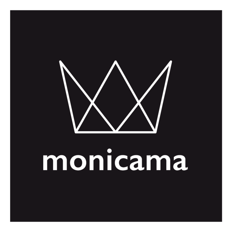
For the logo, I worked with the idea that M in “Monica” and “Ma” have the outlines of a crown (even when they are flipped). My last name also consists of M and A, which combined form a crown. A crown in general is a symbol of high quality, and that’s I wanted my brand to focus on. I’m coming into design after a career in QA, so quality is important to me. Plus a crown is a vintage visual, and I appreciate golden elements, so it worked out perfectly.
Logo creation for monicama brand
monicama logo used in letterheads and business cards
monicama master logo, white on black
monicama master logo, white on black
I’ve always loved the combination of white, black and yellow, as well as vintage motives, so vintage illustrations on top of the golden foil seemed like a perfect fit. One of the main illustrations is the fish, and I chose it because Pisces is not only my sign and my favorite food but also a symbol of the eternal movement in creative space.
The vintage illustrations are displayed on the golden foil background, and I made their outlines go outside the boundaries of the squares. This way the brand incorporated the idea of thinking outside of the box.
For the typeface, I chose Gill Sans because it’s simple and open. I also wanted to take a break from Avenir and Futura, which I love to death. And the secondary typeface is Didot, which I mainly use for decorative elements, mostly italicized. Didot pairs well with the classic and vintage motives I use in branding.
Branding guide for monicama brand
Business cards, monicama brand
A letterhead, a give away, business cards, a Thank you card, a stamp for monicama brand
monicama Thank you card
monicama Give away (postcards, sticker pad, envelopes, business card, box)
Design Solutions | Website 1.0
I wanted my portfolio website to be artful, bold, and reflect my overall personal and creative style. With a background in video production, I certainly wanted to have videos. My passion for graphic design also needed to be reflected. That’s why the first version of my portfolio website had banner videos with logo animation, with gifs sprinkled throughout the projects. However, after going live I got feedback that videos take long to load (they were optimized for the Web but contained large After Effects animation source). I also received feedback that there was a bit too much gold elements. Gosh, I loved these golden graphics, but it was time for them to go.
I also soon realized that I didn’t like the Landing page that much. It did exactly what I wanted it to do - display my projects thumbnails. But I wanted to incorporate videos as their banners and wasn’t able to do it due to technical limitations. Also, on the project pages I wanted to be able to see and access all my projects at all time but the template didn’t allow that. So, a complete revamp of the website was done in June 2019, and this is the end result.

Landing Page for monicama Website 1.0, Dec 2018 - June 2019
Design Solutions | Website 2.0
The redesigned website was created with the goal of fixing the problems I mentioned earlier. Version 2.0 loads much faster because I don’t have videos on the landing page. I decided to combine graphic design and film making by using animated Illustrator files in gifs. Gif are fast to load, looks artful and delightful, and makes the website live and breathe my style.
The second change is that all my projects more visible from the landing page. The new template uses a gallery to display images, and the tiles are much smaller that banners, which is best for displaying projects. When you are on the project page, you can always see all projects and navigate to them from the large vertical menu panel to the left. I absolutely loved that template from Squarespace! What’s even more important, the mobile version looks great, and I especially loved that when you click on the Menu it displays all the projects, and you can easily navigate through the website this way.
Landing Page for monicama Website 2.0
Project Page for monicama Website 2.0
Monicama brand is dynamic and fun, and I wanted the website to reflect that. Below are some animations made in Illustrator and After Effects that I use for banners. Almost every project tile is a gif, and I use gifs throughout the pages.

Monicama Banner Video

Monicama Banner Video
Website Walkthrough Video
Below is a quick walkthrough video capturing the most important pages on monicama website.


Final Notes
I have no doubt that this website will keep evolving as I’m evolving as a designer. For future versions of the website I would like to explore animations using jQuery and embedding a custom code into Squarespace templates. The most challenging part of the project for me was printing the branding materials because of the gold graphics that I was determined to use. I initially wanted the business cards to preserve the gold elements but it turned out to be very costly, most printers were only printing golden ink in large quantities. During my journey to print, I learned a lot about the print process thanks to the helpful and patient local print shop owner. The most exciting part of the project was formulating my professional mission, which was formed gradually but conclusively.