MUSIC MEETS FASHION Branding & Website
Product Management / Design / Project Management
CLIENT: Music Meets Fashion Agency
TIMELINE: November 2018 - May 2019
SERVICES: Product design, Brand Strategy and Positioning, Content Strategy, Website Design, UX/UI
TOOLS: Photoshop, Illustrator, InDesign, Sketch, Squarespace
Case Study
As a fan of both fashion and music, I absolutely loved working on the brand identity for Music Meets Fashion (MMF). MMF is a Germany-based Agency & Festival organization with the goal to represent independent DJ’s, models, designers and art performers globally. A couple of years ago, I did a promo video for MMF, so I was familiar with the overall vibe and mission of the company. Which is to empower creative people worldwide to reach their full potential, build a social network, and organize worldwide music and fashion events.
Working closely with the founder, Raphaello Szmanda, I helped develop product vision and concept, coordinated project management activities, and created branding identity and marketing materials, and designed and implemented a Squarespace website.
Problem Definition
What I appreciated the most about my client’s personality is his determination. He was determined to help people, to tweak the rules of the existing music and fashion industries by incorporating latest technologies like AR and VR, and to have a product that is useful, fun and modern. MMF was at the stage where they needed investors and a team to be able to move forward when we started working together. I was very lucky to start working on this project exactly at this time because I had a unique opportunity to help Raphaello build the product from scratch.
At the beginning of our collaboration, MMF already had a website and some branding and promotional materials. Our goal was to design a new website and a brand identity that will help MMF attract new investors and sponsors, increase awareness, and start building a strong team that will build new amazing products.
Original Home page of MMF website and a MMF logo
Branding Strategy
I started off with the association map where I sketched all associations I had with the words “music” and “fashion”. What stood out was a piano keyboard, black and white colors, and female models. Next was developing a mood board that will guide styling choices and a color palette. I particularly liked black and white imagery with bright accent colors and gold, black and white stripes, and a piano keyboard. Black and white palette and stripes speak of music, while bright colors remind of a fun club scene, and gold adds a VIP aspect to the brand. The client also shared that he planned to have a video channel, and the former domain was at .tv, so I was also exploring various TV glitch effects.
A mood board below pictures some of the inspiration pictures from my MMF Pinterest board.
Mood board for MMF
When brainstorming logo ideas for MMF, I wanted to focus on incorporating letters, a piano keyboard and black and white stripes. Even though this seemed to be a winning idea from the beginning, I explored some other ones as well. Raphaello and I both liked the version that had a letter F in caps overlapped with the piano keyboard because it matched the overall branding style that started to emerge by then.
MMF Logo Sketches
For the website design, we both agreed that Version 1.0 was aimed at solving the following tasks:
a) Attract sponsors and investors.
b) Attract potential team members.
c) Build a mailing list.
Keeping this in mind guided us step by step through the website design which took two months in total. Version 1 is meant to be a short and powerful introduction to the Music Meets Fashion Agency. We planned to use gifs and video content that is fun, engaging, bold and playful. We also decided to focus on CTA and contact forms on various pages to encourage people contact MMF.
Design Solutions | Branding
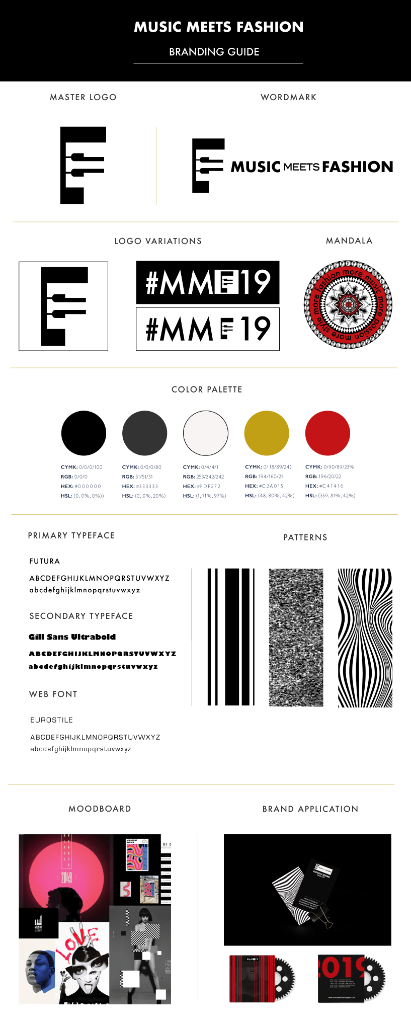
I used primarily black and white colors in MMF branding because they remind us of timelessness and classics, just like both music and fashion do. Gold complements the design by adding a touch of quality and high standards. Red is a color of passion and a heartbeat, and goes very well with a black and white palette. We used images of models, musicians, color blocks, overlays and other creative elements throughout the branding materials.
The main logo is a blend of a keyboard and a letter F. A word mark version of logo incorporates the logo and a company name. We also designed a “#MMF19” variation with the letter F acting as logo - this version can change each year celebrating a dynamic and evolving MMF brand.
The typeface Futura was used as I appreciate its appearance of efficiency and forwardness. Gill Sans Ultrabold was used in some merchandize because we appreciated its boldness. For the website we used a font called Eurostile as it looked more interesting than Futura.
MMF Branding Guide
MMF Master Logo
MMF Wordmark Logo
MMF Secondary Logo
MMF Mandala, red
MMF Business Cards
MMF Letterhead
MMF CD cover, front
MMF CD cover, back
MMF Banner, Landing Page
MMF Festival Brochure, cover
MMF Festival Brochure, insert
The client wanted to showcase some fashion products on the Store page of the website to show sponsors and other site visitors the full potential of MMF. So, I mocked up sample products incorporating MMF logo variations, MMF mandala that I created, as well as some mockup screens for the Z app, a product that MMF is planning to develop in the nearest future.
MMF Pins
MMF Tshirt
Design Solutions | Website
Because the main goal of the first version of the website was to attract investors and start building a mailing list, it was crucial to design a home page that will successfully address these needs. Users can read about the company immediately, with a Read more button linking to About page. We encourage email signups, so the Join us section granting a free song after subscribing is high visibility. I also wanted to let visitors know what personas and needs Music Meets Fashion are serving, and that’s how the How we can help section emerged. Followed by the Listen to music and Our events sections that link to the corresponding pages of the website, is a contact section with greeting to our target personas for this version - sponsors and potential team members.
I envisioned MMF brand to be bold, playful and dynamic. Using gif images throughout the website seemed to be a great solution because they weight much less than a video, are time efficient, and add much playful dynamics to the pages. I also incorporated a glitchy TV effect into the images and gifs to make it more fun, and to honor MMF plans to create its own video channel.
As a music producer with 25 years of experience in music and entertainment industries, Raphaello was definitely the heart of MMF, and I wanted to tell his unique story. His picture opens our story page, followed by a short personal bio and a mission statement.
Home Page, www.mmfagency.com
My client has a good heart, and he wanted to donate a certain percentage of his profits to charity. It just happens that my friend, a photojournalist Ksu Postolnik, just came back from a journey to an orphanage on the island of Sumba in Indonesia. As soon as I saw her pictures with the children in national costumes dancing, I immediately saw the connection. Events page has a separate section with this beautiful picture along with the MMF values statement.
Our Story Page, www.mmfagency.com
Events Page, www.mmfagency.com
Website Walkthrough Video
Below is a quick walkthrough video capturing the most important pages on Music Meets Fashion website. Feel free to browse the website: www.musicmeetsfashionagency.com.
Final Notes
I really enjoyed redesigning MMF branding identity because the opportunities for exercising my imagination here are virtually limitless. My client Raphaello was very excited to participate in every stage of developing the branding identity for his product. It’s always a pleasure working with people like this! The most exciting part was for me was surfing the internet for the images that I could tweak later in Photoshop. I think in graphic design half of the success of the final graphics is attributed to the right image. The most challenging part was perhaps getting to really feel a brand. I started with purple and blue color palette, but as I proceeded with designing a website I realized that it just didn’t click with the overall modern art direction. After I discovered the stripes, it all came together in a satisfying way. Bon Voyage, Music Meets Fashion! Love and light, as my client likes to say.
View my other projects on Behance!


