Creative Director
Sparkpick | Curated eco fashion marketplace
Overview
Sparkpick is a curated eco fashion styling marketplace which offers fashion looks spanning across various occasions and fashion styles. All fashion is curated from trusted sustainable fashion brands. Sparkpick mission is to guide fashion lovers towards mindful consumption and help save time on personal styling. As a Creative director, I’ve been shaping brand, design strategy and storytelling, managing the product design process, and building a strong community excited about shifting the future of the fashion market towards mindful consumption.
The problems
The main goal for the Sparkpick project is to build a personal styling platform that helps fashion consumers arrive at a minimalist wardrobe they love and wear. Why is this important?
The garment industry is one of the markets that are driving pollution and modern slavery. In the world of fast fashion, it takes 2700 liters to produce one cotton t-shirt. That's enough for one person to drink for 2.5 years. Not only that - people who make our clothing, mostly women and children, do so in unfair work conditions in the countries of the third world for as little as $1 a day. Fast fashion might seem cheap for us but it is expensive for the planet and has a cost of a human life.
Another problem is the consumerist spirit of new purchases, lack of basic styling knowledge, and the good old “never good enough” story. Humanity consumes 60% more clothing now than we did 15 years ago. We only keep these garments for half as long before throwing them in the trash. The entire capitalistic machine is set up to feed us things we don’t need, and resisting it, unfortunately, is not taught at schools yet.
User research & insights
Sparkpick started in 2020 as an educational blog that mostly talked about fast fashion and sustainable fashion and occasionally recommended fashion products through affiliate links. However, during an ongoing user research, it turned out our customers didn’t have enough time or desire to read about the horrors of fast fashion. Instead, they needed an affordable, fast, and fun way to get personal styling services.
For the 2022 Sparkpick website redesign project our creative team wanted to answer some high-level product questions. The first step in the redesign process was to kick off an Amazon Turk survey, which had 17 questions and was sent to 124 female respondents worldwide. The survey results sparked insights that helped us answer our three research questions and develop a design strategy that focuses on a more general fashion styling approach.
New design persona
The emerging design persona was Joanna, a marketing professional in her late 20s who has been already supporting sustainability in some ways. Her pain point is having no knowledge about personal styling and no time to learn about sustainable fashion.
The new design persona for the Sparkpick website redesign was created based on the user research insights
Design principles & sustainable Web design
The Internet has a massive environmental impact. According to some estimates, it generates 1.6 billion annual tons in greenhouse gas emissions. It was crucial for us to incorporate Sustainable Web design principles into the website redesign.

Redesigned UX
The three challenges and areas we worked in our redesign as a team were:
Styling: how do we help Sparkpick switch from a blog to a styling platform?
Findability and control: how do we make it easier for the customers to search for fashion products and save them?
Value prop: how do we communicate our company value proposition and the overall value of switching to sustainable fashion consumption better?
Our UX design approach addressed these key points. In the MVP version of the redesigned website, we focused on redesigning Information Architecture to align with the personal styling direction and communicating the value proposition.
#1 Separating shopping & educational journeys
We separated educational and shopping/styling user journeys. In the user research we had learned that people prefer to either shop or read, which gave us an idea of keeping those separate. First we combined two similar educational pages Blog and Style guide into one and called it Blog. Then we introduced two tabs for each journey - “Shop & style” with affiliate products and “Learn eco fashion” with only educational content.
#2 Focus on the shopping journey
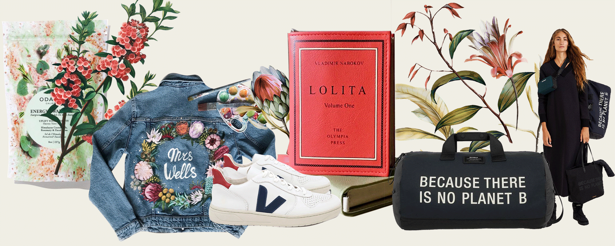
Initially, the group of pages called Shop by Occasion contained the majority of our curated fashion collections. It allowed customers to select looks for home, work, casual activities, and sport. However, thinking about the larger context of personal styling inspired us to brainstorm other ways we could offer styling. Some other ones were shopping by body shape, by fashion style, and by fabrics. The redesigned version incorporated some of them in MVP in the Style & shop section.
The new Style guide page also has cross-linking to the monetized blog posts in the Blog and a new look section which will be changing weekly. The main goal of this series of pages was to serve the fashion shopping journey.
#3 Clear value prop
One of the customer complaints about the existing version of the website was that people didn’t understand the value of our services and the value of switching to eco fashion in general. We addressed this problem by introducing two sections on the Landing page - “What we do” and “Our positive impact”. The first explained the services we are offering, while the second one - environmental impact of transitioning to sustainable fashion consumption. Similar sections were implemented on a couple of other website pages, including About us page.
#4 Improved discoverability & control
We designed an e-commerce Store allowing customers to easily view all fashion products, search, sort, filter, and save them.
Our previous implementation of affiliate products was done through the affiliate marketing plugin Lasso and wasn’t scalable with the new direction of our business growth. The old implementation didn’t allow much control over discoverability of the products. In the redesigned website, Store was functioning as a database of our personal styling products, where people can filter clothing by occasion, body shape, style, material, and more. In addition, the individual product pages started communicating value prop as well by listing brand’s sustainability efforts.
#6 Improved Search functionality
We significantly improved our Search functionality. Previously website visitors were shown only links to the blog posts that mentioned a searched input. In order to improve discoverability in the UX, we started displaying all relevant products first in the “Shop” section, followed by the blog links and the “Top searches” section. The “Shop” section also contained our new filters and sort menu if more than 50 products were found, in alignment with the new Store page. This approach has significantly increased user engagement from the Search page making it an entry point to the purchasing funnel.
#6 Ability to login and add to Favorites
On the redesigned website, we also allowed customers to favorite products and view them on a dedicated Favorites page. Users are now able to login with social networks, easily locate their wishlist, and follow-up on purchasing them if they want.
Design system
The entire design system was redesigned for this project, which included colors, typography, grid and spacing, iconography, visual components, new product cards, and buttons.
Eco-friendly colors
Initially, the brand colors were more editorial-inspired and included black, white, and dusty pink. After running user research and revising the design persona, we introduced more green colors as brand colors to align with the user’s mental models. We added a wide array of neutral monochrome gray colors, as well as accent colors that can be used across social media content and website banners.
Efficient Web typography
The original design system heavily relied on commercial fonts like Oswald, which increased data transfer and number of server requests required to load the page. We were also experimenting with different font weights, which increased the number of font files, adding bulk to the page.
The redesigned typography system introduced only two fonts - Verdana and Cormorant Garamond. Verdana, a system font, intended to be used for smaller body text, is the most efficient choice because it comes pre-installed on devices and thus requires zero server requests. Cormorant Garamond was incorporated as a high-impact non-system font used for headings to create more visual weight. In general, Garamond is considered to be one of the most readable and legible typefaces in print due to its lower ink usage.
Consistent grid, spacing & buttons
Initially, Sparkpick website lacked consistency in spacing and grid alignment. We introduced a grid and a spacing system aligned to Material Design, where all components align to an 8dp square baseline grid for mobile, tablet, and Desktop. This helped increase visual consistency throughout website pages tremendously. Consistency was also achieved by developing specs for the website buttons and assigning distinct roles to them.
Upcycled iconography
Striving for the most sustainable iconographic solution, we decided to modify existing stock icons related to sustainable concepts. Purchased on Adobe Stock, this collection of icons is intended to be used on the Landing page and on the product pages, communicating our sustainability efforts and those of the fashion brand we feature on the website.
Product cards & vector imagery
We designed three new card components for the product pages: small, medium, and large cards. Anticipating browsing experience with the slower Internet and also largely inspired by the low-impact version of Organic Basics website, we created a more sustainable card solution. When our visitors browse the future Store with the limited Internet connectivity, they will see vector imagery instead of the product photographs. We anticipate this experience to be an example of rather radical but still working and functional design, which can be much less data intensive that the regular Sparkpick version.
Key insights
Sparkpick website redesign project was a very challenging and yet rewarding experience for our design team. The new design approach allowed us to develop an entirely new product - a sustainable fashion styling platform - moving away from the standard blog format.
One of the key insights for me was that in order to design a product that fosters mindful behaviors like conscious fashion shopping, we need to run thorough user research, define a design persona, their core needs, mental models, and, most importantly, core values. We could later associate those values with how we present content on the website and in social media. Another important insight was that when it comes to design for behavior change and sustainable design practices, it is crucial to do competitive research and analyze the existing design patterns.
The new website will be live by the end 2022, and our team is very excited about the impact it can potentially bring to the world of sustainable fashion styling.