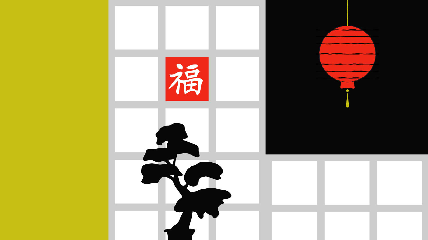
Much more than you might think. The concept behind Feng Shui dates back 6,000 years and is derived from an ancient poem that talks about the connections between a human life and the environment it flows in. Feng Shui literally translates as "wind" (feng) and water (shui). It refers to the spatial arrangement of objects relative to the flow of energy (chi).
In Feng Shui, the world is driven by unseen forces. So, we need to “unblock” their way, helping these forces flow freely and create balance in a space. That’s why Feng Shui is all about arranging our surroundings in the most harmonious and optimal way. Most scholars agree that Feng Shui originated as a method of burial that evolved over time. Today its concepts are used in architecture and city planning, interior design, and design in general.
Feng Shui and UX Design share a common goal: to create harmonious spaces that make us feel safe, productive, and at ease.
Both of them focus on balance, decluttering, and function to achieve this goal. Both disciplines are working with layout, framework, materials, and colors.
Balance
Balance is one of the central themes in Feng Shui. For example, we can balance the energy at home with mindful furniture placement and colors. Balance is also a recurring theme in UX design, where we need to align business goals and customer goals, design, content, layout, typography, and color choices.
Decluttering
Clutter in Feng Shui means unfinished decisions and stagnant energy that destroys harmony, blocks our motivations, and makes us feel stuck. That’s why each item should have a designated place at home, and cleaning and decluttering should be done often to unblock chi from flowing freely. The equivalent of this in UX design is using white space, which decreases cognitive load and helps people scan a page or any other surface faster. That’s why we should think twice before publishing long grid pages or overwhelming people with ads scattered all over the place.
Functionality
Feng Shui is essentially about making space more functional. An energy map called Bagua is used to analyze the flow of chi, which is overlaid over a room’s floor plan. The word “bagua” translates as “eight areas”. Each of these areas is associated with different aspects - family, career, love, prosperity, and other. For example, your bedroom aligns with your health in bagua and ties to the earth element. You can, thus, incorporate earth tones or clay pottery there to feel more rejuvenated.
UX design inherited focus on Balance, Decluttering, and Functionality from Feng Shui
Like Feng Shui, UX design is also all about functionality. Each design element should serve a purpose and be useful to the viewer. A Call button on your phone is meant to initiate a call and not take you to the email, for example.
In sum, it won’t be that much of a stretch to say that Feng Shui is a remote ancestor of UX design and leveraging its principles can help create harmonious and fruitful user experiences.
Can you think of any example of Feng Shui concepts in your personal or professional life?


